- Noi îți inventăm casa virtuală!
- +40 722-251-567
- +40 756-507-744
- contact@webinvent.ro
What is a responsive design !?

What is a favicon !?
21 January 2020
What is web content !?
22 January 2020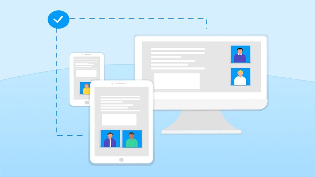
Everyone has been talking lately about responsive web design. Basically, we no longer make a mobile version of the website or the online store, but we think it completely responsive, from the beginning.
What is responsive web design?
A website is responsive if it has the ability to adapt the layouts (design) of the pages according to the viewing environment (more precisely the screen resolution - desktop, laptop, tablet, phone), without suffering major degradation, to offer them users an excellent browsing experience.
The concept of Responsive Design was first introduced in 2010 by Ethan Marcotte in his article written on AListApart but has gained popularity in the last 2 years. It is based on 3 essential elements:
Fluid grids, which take into account a wide range of resolutions. As the resolution changes, the elements on the pages are resized / rearranged.
Flexible images, which can change their height or width depending on the grid, Media queries.